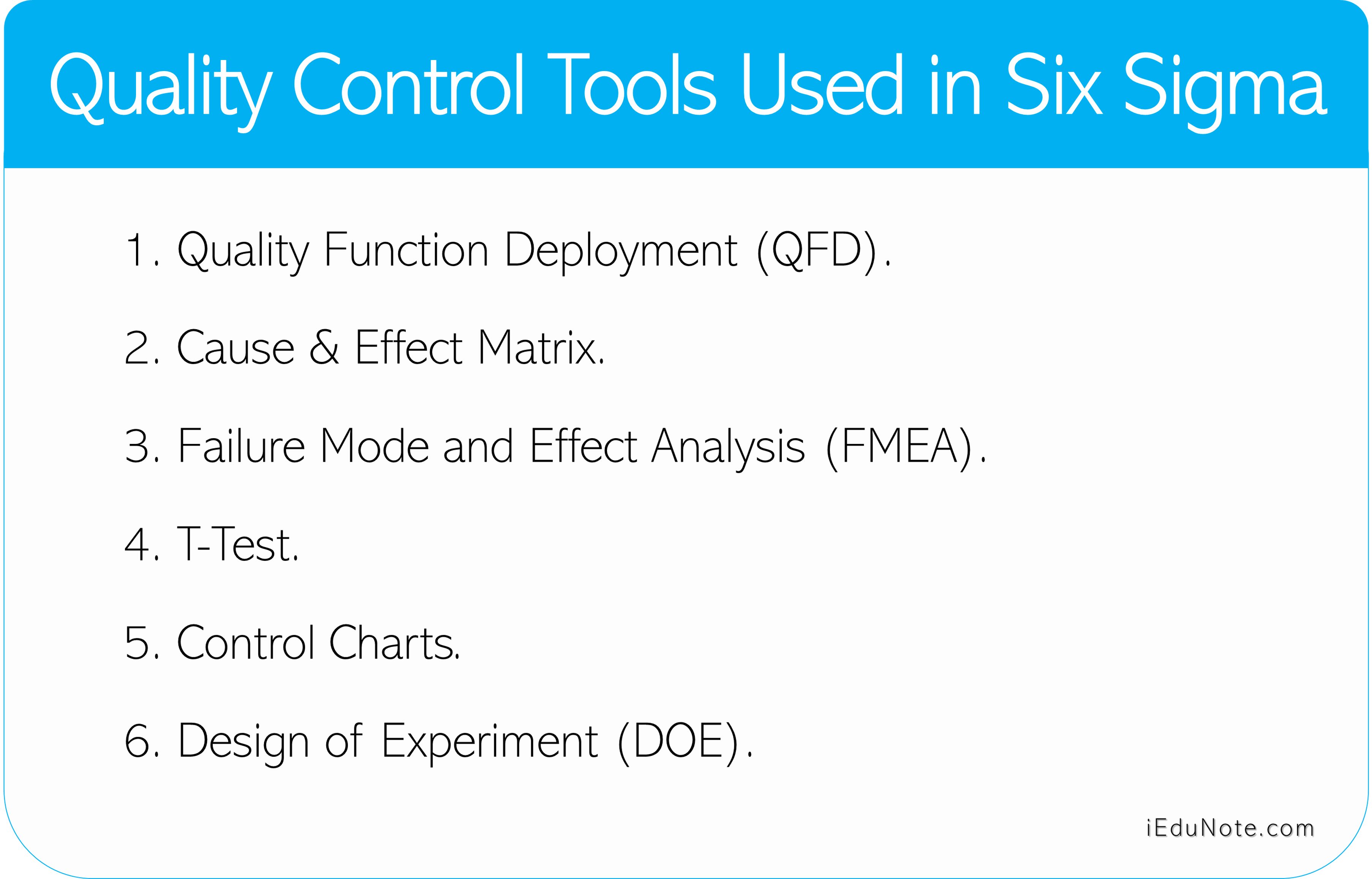
A tool is a mechanism by which Kelps accomplishes the purpose of a technique. While statistical process control (SPC) tools are excellent problem-solving tools, there are many situations where they are inappropriate. The Japanese Society for Quality Control Technique Development offered seven quality management and planning tools. The seven tools mentioned below are useful for top and middle management for strategic planning, goal setting, and problem-solving:
7 Tools For Management and Planning
Affinity Diagram

An affinity diagram is a mechanism that generates various ideas about an issue by a team through consensus decisions and then logically groups them for problem-understanding and problem-solving.
Firstly, the members of the groups are allowed to put their ideas on separate pieces of paper, and then the team gathers all the ideas into natural groups. This diagram is used to organize verbal information into a visual pattern.
There are six steps to generate an affinity diagram:
Step 1. Identify the Problem
Write the problem or issue on a blackboard or flip chart.
Step 2. Generate Ideas
Use an idea-generation technique, such as brainstorming, to identify all facets of the problem. Use index cards or sticky-back notes to recode the idea.
Step 3. Cluster Ideas
Cluster ideas, on cards or paper, into related groups. Ask, “Which other ideas are similar? And “Is this idea somehow connected to any others?” to help group the ideas together.
Step 4. Create a Header Card
Create an affinity card (header card) for each group with a short statement describing the entire group of ideas.
Step 5. Break into Cluster
Attempt to group the initial affinity cards into even broader groups (clusters). Continue until the definition of an affinity cluster becomes too broad to have any meaning.
Step 6. Complete the Affinity Diagram
Lay out all of the ideas and affinity cards on a single piece of paper or a blackboard. Draw borders around each of the affinity clusters. The resulting structure will provide valuable insights about the problem.
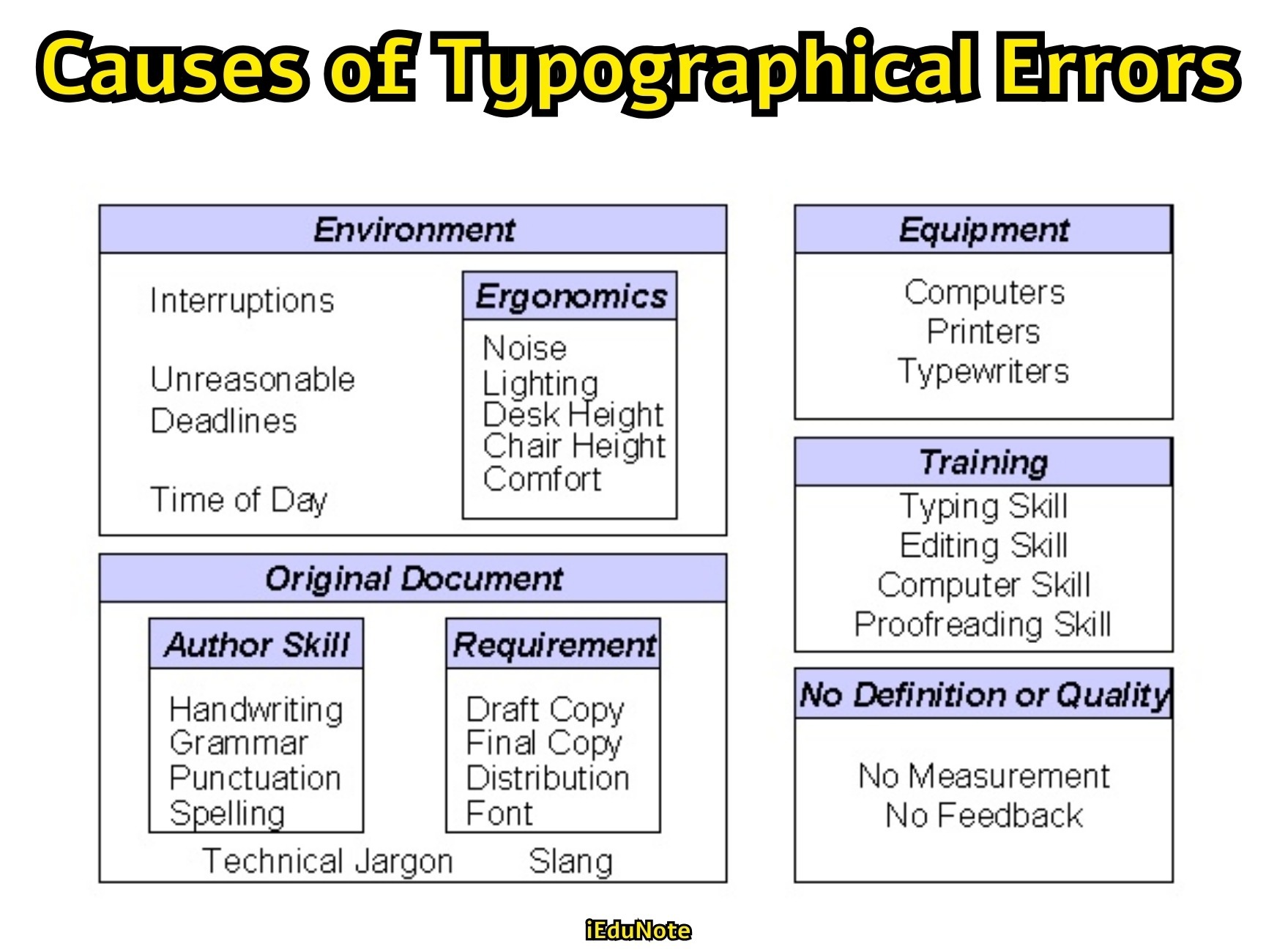
Causes of Typographical Errors
Arrow Diagram
An arrow diagram is also known as Activity Network Diagram, Project Evaluation and Review Technique (PERT), or Critical Path Method (CPM). This method establishes a sequenced plan and tool for monitoring progress.
The graphical structure of the arrow diagram is either vertical or horizontal, connecting the planned activities or events. This is a very useful tool when we want to plan the activities of a known but complex task or project.
With the help of this tool, we can work out an ideal project plan and also a daily plan for not only the main task but also for other allied tasks and monitor their progress in an effective manner.
Uses of Arrow Diagram
- Manages a complex project or task.
- Manages the important project of the organization where the consequences of the late completion are severe.
- Enables management of a project with multiple activities.
- Assist in explaining the project status to others.
- Helps implement plans for new product development and its follow-up.
- Helps develop product-improvement plans and follow-up activities.
- Develops plans for experimental trials and follow-up activities.
- Develop daily plans for an increase in production and their follow-up activities.
- Helps develop plans for a facility move and for monitoring follow-up.
- Plan and follow-up QC inspections and diagnostic tests.
- Plan and follow-up QC conferences and QC circle conferences.
Relations Diagram (Interrelationship Diagram)

The interrelationship diagram showed the interrelationship of many factors of a complex situation. It is a tool for finding solutions to problems that have a complex causal relationship. It allows the team to classify the cause-and-effect relationships among all the factors so that the key drivers and outcomes can be used to solve the problem.
Steps of Interrelationship Diagram:
Step 1: Identify the issues or problems clearly, write the problems on a card and stick it on the center of a board.
Step 2: Determine the factors related to the issue. These will be the headers from a previously completed affinity diagram. Place the cards containing these factors in a circle around the issue card.
Step 3: Determines the cause and effect relationship between any of the cards if a good relationship exists.
Step 4: Analyze the relationship. Cards that have the most arrows going from them tend to be the root causes. Cards that have the most arrows going to them are the root effects.
Uses of Interrelations Diagram
- Identify the key issues from a list of issues.
- Identify the important problems from a plethora.
- Identify the root cause of existing problems.
- Identify the key factors needed to make a data-driven decision.
Tree Diagram
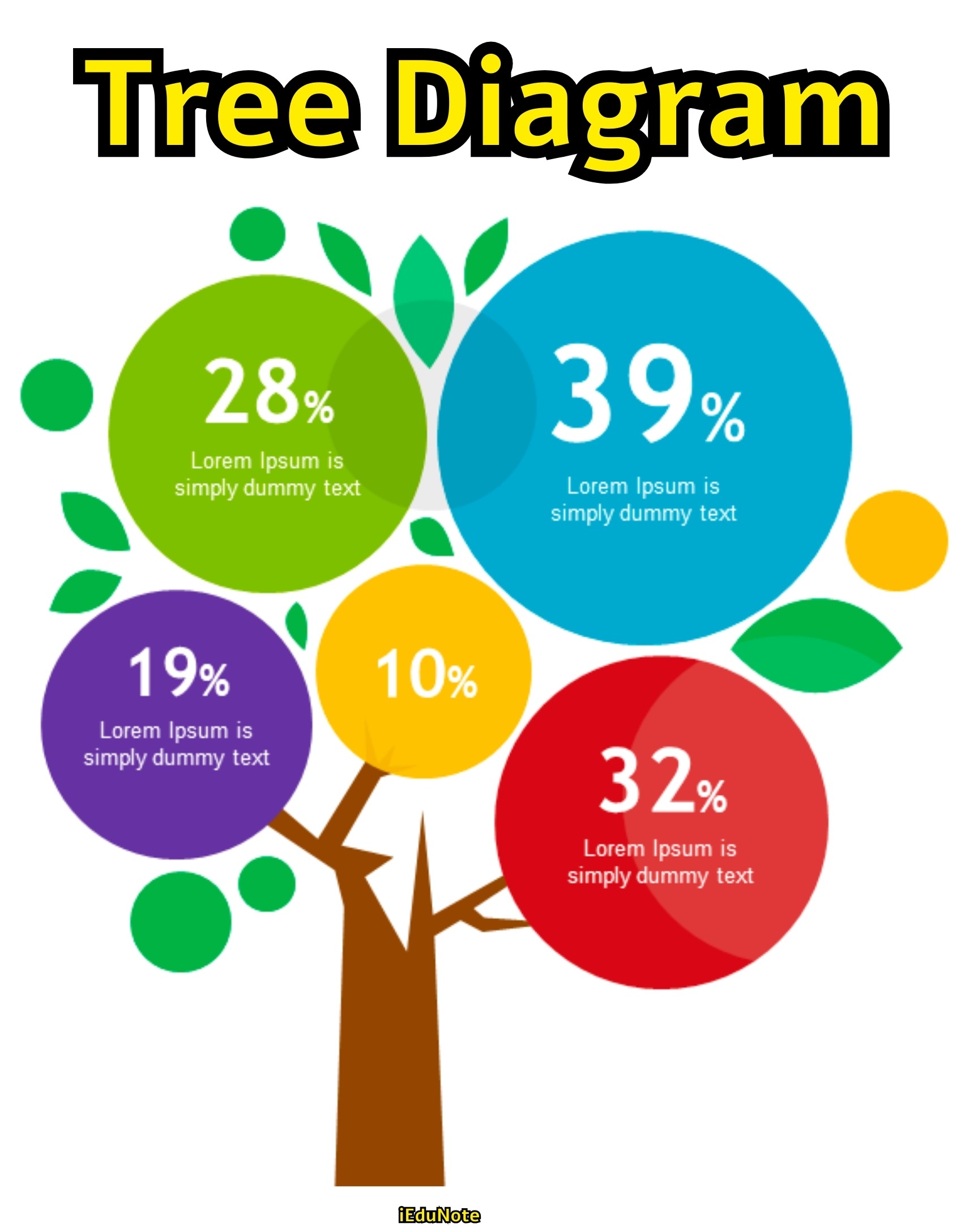
A tree diagram is also known as a systematic diagram. It is a technique to reduce broad objectives into increasing levels of detail to achieve the objective. This diagram assists teams in exploring all the options available to solve a problem or accomplish a task. Such a diagram does not only reveal and clearly the magnitude of the problem.
Steps Involved in Generating a Tree Diagram:
Step 1: Identifies a clear action-oriented goal statement to which the entire team agrees. Such a statement basically comes from the driver identified in an interrelationship diagram or from the headings of an affinity diagram.
Step 2: Subdivides the goal statement into major secondary categories. These branches should represent goals, activities, or events that directly lead to the primary objective or that are directly required to achieve the overall goal.
Step 3: Break each major heading into greater detail. Here, the tasks and activities should become more and more specific. Stop the breakdown of each level once there are assignable tasks.
Step 4: Review the diagram for logic and completeness. This step makes sure that each subheading and path has a direct cause-and-effect relationship with the one before.
Uses of Tree Diagram:
- It helps develop a sequence of steps that depend on each other and from the solution to a problem.
- It is used when it is known that the implementation of a task will be a complex matter.
- It is used when missing a key step in implementing the solution to a problem can lead to serious consequences.
Matrix Diagram

The matrix diagram technique helps individuals or teams to systematically identify, analyze and rate the relationship between lists of items. This is a tool that is used to organize information that must be compared on a variety of characteristics to make a comparison, selection, or choice.
This matrix diagram technique clarifies problematic spots through multi-dimensional thinking. This method identifies corresponding elements involved in a problem situation or event.
These elements are arranged in rows and columns on a chart that shows the presence or absence of relationships among collected pairs of elements.
Steps of Matrix Diagram:
- Step 1: Determine the factors that are important for making a correct selection.
- Step 2: Select the type of matrix to be used. L-shaped matrices are used for two-factor comparison. T-shaped for three-factor comparisons that display indirect and direct relationships, and Y-shaped are used for three-factor comparisons that show direct relationships only.
- Step 3: Select relationship symbols to be used.
- Step 4: Completes the proper matrix using the appropriate factors and symbols.
- Step 5: Examine the matrix and draw the appropriate conclusion.
Matrix Data Analysis Diagram

The matrix analysis method is also known as ‘Principal Component Analysis.’ This method quantifies and arranges matrix diagram data so that the information is easy to visualize and can show more general indicators that differentiate and give clarity to large amounts of complex, intertwined information.
Uses of Matrix Data Analysis:
- This method analyzes production processes in which factors are complexly intertwined.
- It analyzes causes of nonconformities that involve a large volume of data.
- It grasps the desired quality level indicated by the results of a market survey.
- It classifies sensory characteristics systematically.
Process Decision Program Chart (PDPC)
")
The process decision program chart is considered a potent and useful tool that avoids surprises and identifies possible countermeasures. This technique helps map out all the conceivable events or contingencies that can occur in the implementation stage and find feasible countermeasures to overcome these.
Uses of Process Decision Program Chart:
- This method can establish an implementation plan for management by objectives.
- It helps in establishing an implementation plan for technology-development themes.
- It helps establish a policy of forecasting and responding in advance to major events predicted in the system.